Evenly Sized Hiragana: Which Letters to Write Narrow, Flat or Wide
 Hiroki Obara · DeveloperStudyX Japanese Letters TracerHow-To
Japan’s education ministry publishes a commentary on the elementary school curriculum, and its section on handwriting for grades 3 and 4 defines the size of kanji and kana as something relative, arising from how characters balance against each other. It then says that writing characters with more strokes larger and characters with fewer strokes smaller gives a line that is easy to read.
“Keep your letters even” is easy to take as “write every letter the same size”. That passage says the opposite. A line that looks even is made of letters that are each a different size. This post is for learners of Japanese whose hiragana are correct but look uneven on the page, and for parents helping a child with the same thing.
Measuring the letters
KanjiVG is the public character data behind the hiragana stroke order pages on this site (in Japanese). Measured in that data, the 46 basic hiragana vary a lot in width and height. The numbers below are approximate lengths from the end of one line to the end of another, with the data’s square as 100.
| Group | Letter (width × height) |
|---|---|
| Narrow | く (22×72), う (34×73), り (34×69), し (42×68) |
| Flat | へ (72×39), つ (70×47), い (64×48) |
| Narrow and short | こ (45×54) |
| Wide | す (71×76), わ (72×72), む (72×69), ね (72×67) |
The heights of く and す are almost the same, 72 and 76. The difference is in the width, 22 against 71. へ is the opposite: about as wide as す, and about half its height.
So in this data, the letters that look small are not shrunk all over. く is narrow, and へ is low.
Stroke count isn’t the whole story
The rule that fewer strokes means smaller shows up as a general trend in this data. く, the smallest by area, has one stroke. す, the largest, has two, and む has three.
Not every one-stroke letter is small, though. の is 68×57, ひ is 71×63 and ん is 68×70.
Grouped by shape, there are three kinds. Letters built around a vertical line are narrow. Letters built around a horizontal line are flat. Letters whose lines loop or cross use more of the square and are wide.
When every letter fills the square
If every letter fills the square, the differences in width and height disappear.
In すし (sushi), stretching し to the width of す makes its lower curve balloon. In くつ (shoes), widening く opens up the angle at its bend. Making つ taller pulls its top and bottom lines apart and changes the shape.
Keeping each letter’s own width and height makes the line look even.
Put flat letters at mid height
In the data, へ runs from 31 to 70 measured from the top, with space above and below it. It sits at mid height, not on the bottom of the square.
The same commentary lists lining up the centres of the characters on the centre of the line. Alphabet letters stand on a baseline. Japanese is aligned on the centre of each character.
つ is not the same as small っ
If つ is shrunk all over, it becomes hard to tell apart from small っ.
Write みっつ (mittsu, three things) and the two sit next to each other. つ has a width of 70. It is low, but it keeps its width and is a full-size letter. っ is written small, in the lower left of the square in horizontal writing and the upper right in vertical writing. Details are in Where to Write Small っ, ゃ, ゅ and ょ.
Next to kanji, write kana a little smaller
The commentary notes that kana are generally said to look better written smaller than kanji, because they have fewer components.
In 書く (kaku, to write), 書 has 10 strokes and く has one. In squares of the same size, the 10 strokes of 書 are cramped. Writing kana a little smaller than kanji leaves the kanji more room.
When Japanese schools teach this
In the Japanese curriculum, children learn “the shape of a letter”, meaning its rough overall form, in grades 1 and 2. Size appears in handwriting in grades 3 and 4.
Schools start with each letter’s shape and stroke order, and come to size in a line of letters after that.
A practice order
Balance shows up when letters are next to each other. On paper, practice can go in this order.
- Check letters one at a time in squares with a cross guide. On the model, see how much of the square く takes up, and how much space sits above and below へ.
- Write narrow and wide letters side by side. く next to す, し next to わ.
- Write two-letter words. すし, くつ, いす (chair), いし (stone) and へや (room) combine narrow, flat and wide letters.
- Write a short sentence and step back. Choose the one letter that stands out and fix only that.
Where StudyX Japanese Letters Tracer fits
StudyX Japanese Letters Tracer is an iPhone and iPad app for practising the shapes and stroke order of hiragana and katakana, one letter at a time. The screen has almost no words, only icons and kana, so it works whatever language you speak.
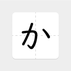
When you choose a letter, the model grows one stroke at a time in stroke order. When you finish, the model is gone and only your own letter remains. With the dotted cross guide switched on, you can check afterwards how far your く reaches from the vertical centre line, or where your へ sits between top and bottom. The model letter can be switched between large, medium and small.
It covers 142 characters: hiragana and katakana with their dakuten and handakuten forms. It is a one-time purchase with no ads and no in-app purchases. On iPhone it runs in landscape. For a first session, see Getting Started with StudyX Japanese Letters Tracer.
Sources
- Ministry of Education, Culture, Sports, Science and Technology (Japan), commentary on the 2017 elementary school curriculum guidelines, Japanese language
- KanjiVG (Ulrich Apel, CC BY-SA 3.0), hiragana data

 StudyX Japanese Letters TracerPractice writing hiragana and katakanaSee the app →